Video showing the process of rubber stamp carving
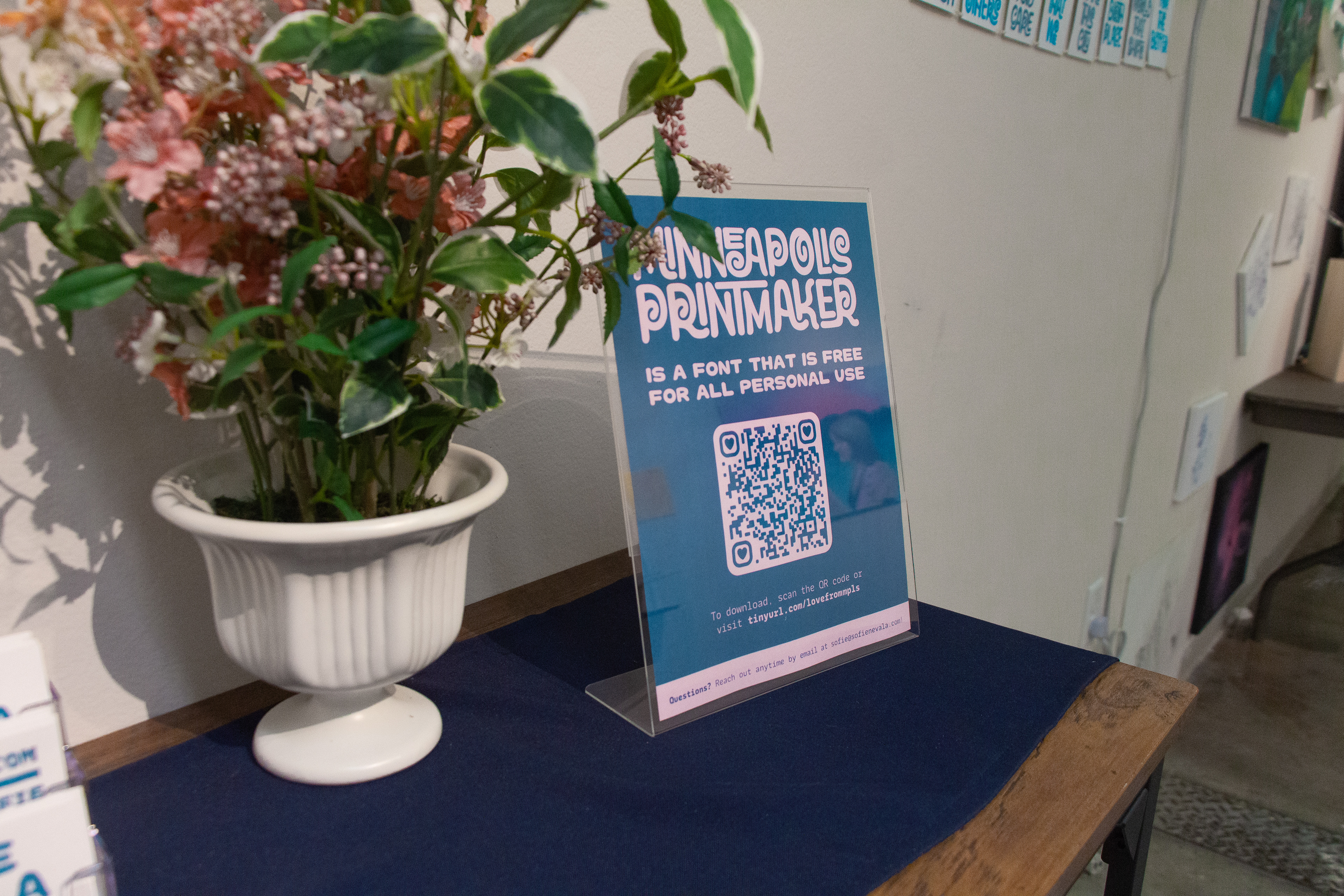
Download the typeface Minneapolis Printmaker (free for all personal use) at tinyurl.com/lovefrommpls
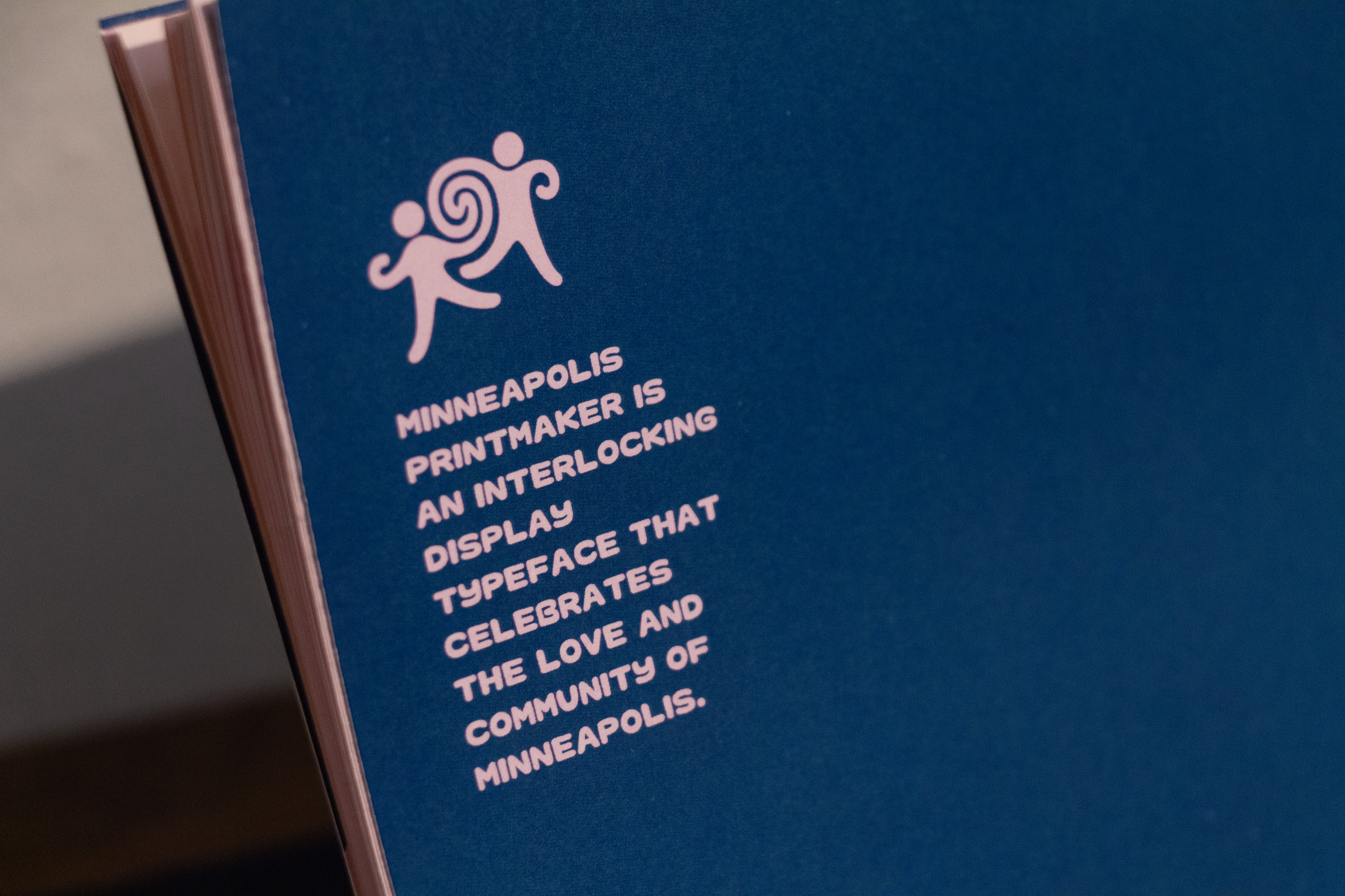
Minneapolis Printmaker was created in response to a time of turmoil in Minneapolis, as over 3,000 ICE agents were deployed to Minnesota during the height of Operation Metro Surge. I witnessed firsthand the cruelty of the administration, the incompetence of law enforcement, and the fear that it instilled in the lives of so many of my friends and communities.
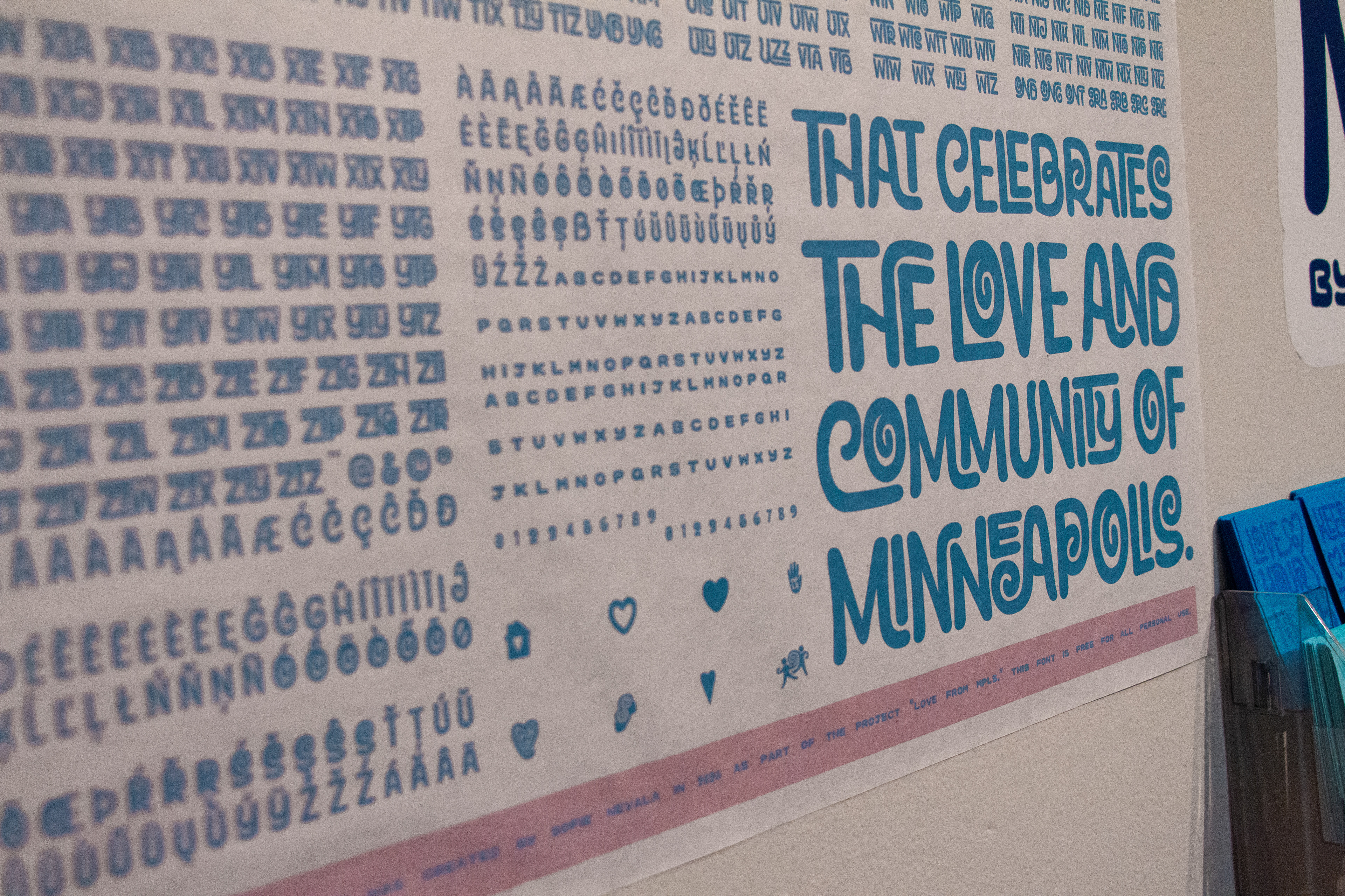
As our neighbors were openly abducted from the streets, their places of works, and their homes, I saw a near-complete unification of everyone around me. We were on the streets patrolling and checking on our neighbors, organizing food drives and mutual aid campaigns, gathering together for protests, and holding each other as we mourned the people and things we lost. This surge of love and care became a deep and powerful counter-movement to the hate we endured, and was deeply inspiring to myself and those around me. It is from this movement that Minneapolis Printmaker was born; this typeface represents the community of Minneapolis that I have grown to love so dearly.
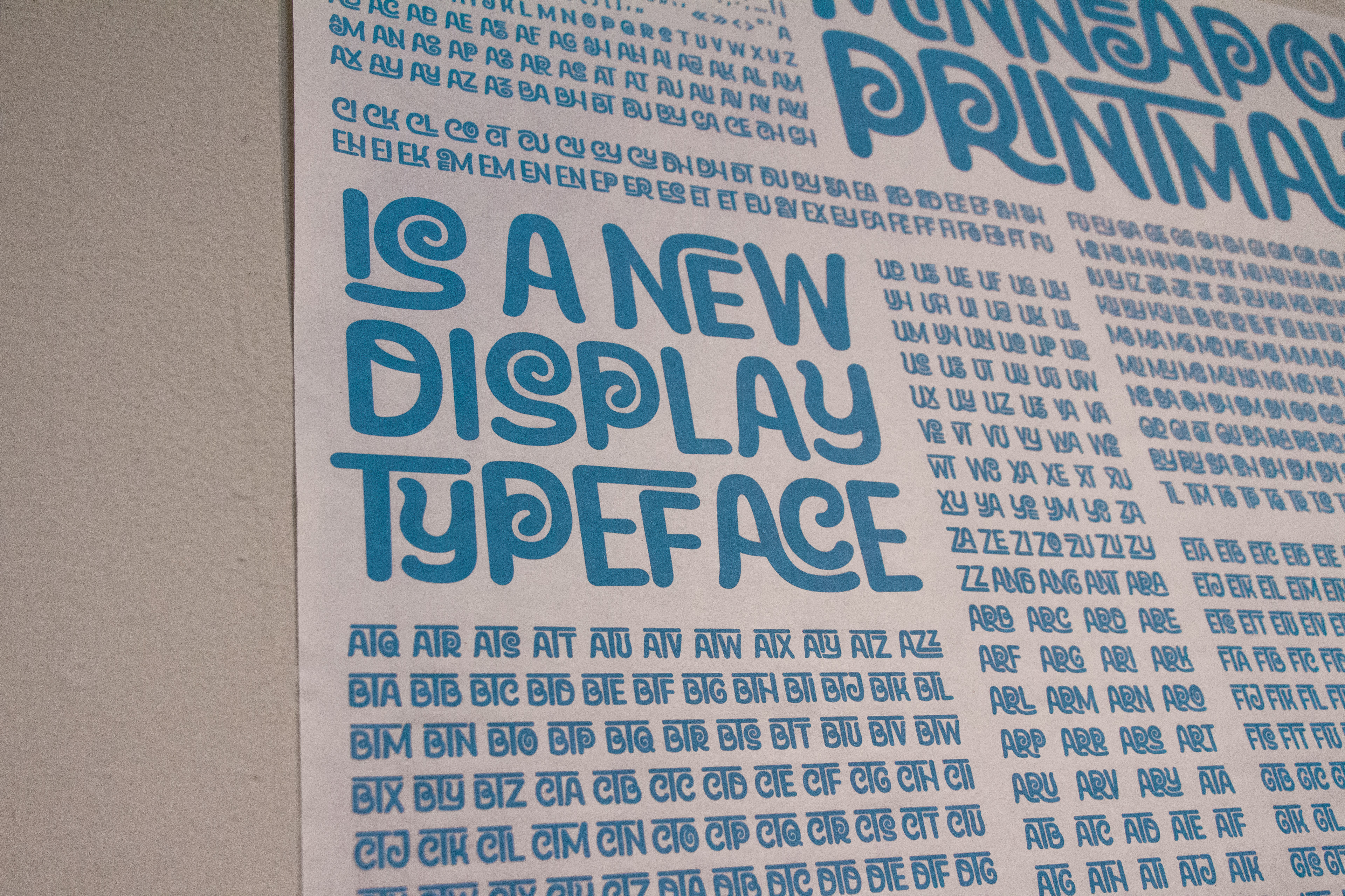
The typeface draws on aesthetics from hand-rendered typography seen in protest posters, local music posters, printmaking, and more. The concept of the spiral became foundational as not only a symbol of whimsy and warmth, but as a symbol of growth and interconnectedness. Having the letters interact and intertwine automatically was also essential to the concept of this typeface as a way to represent the ways that people interact and work together to form movements larger than themselves. As the letters interlock, new shapes and textures come together.
The interlocking is achieved through a huge set of contextual alternates that automatically swap out based on the surrounding characters. Interlocking typefaces are difficult to come across due to the sheer amount unique letter combinations that need to be created. I would like to give a thank you to Ed Benguiat, Ken Barber, and Tal Leming at House Industries for paving the way for this style of typeface through the font Ed Interlock (2004), which encouraged me to know that this project was possible.
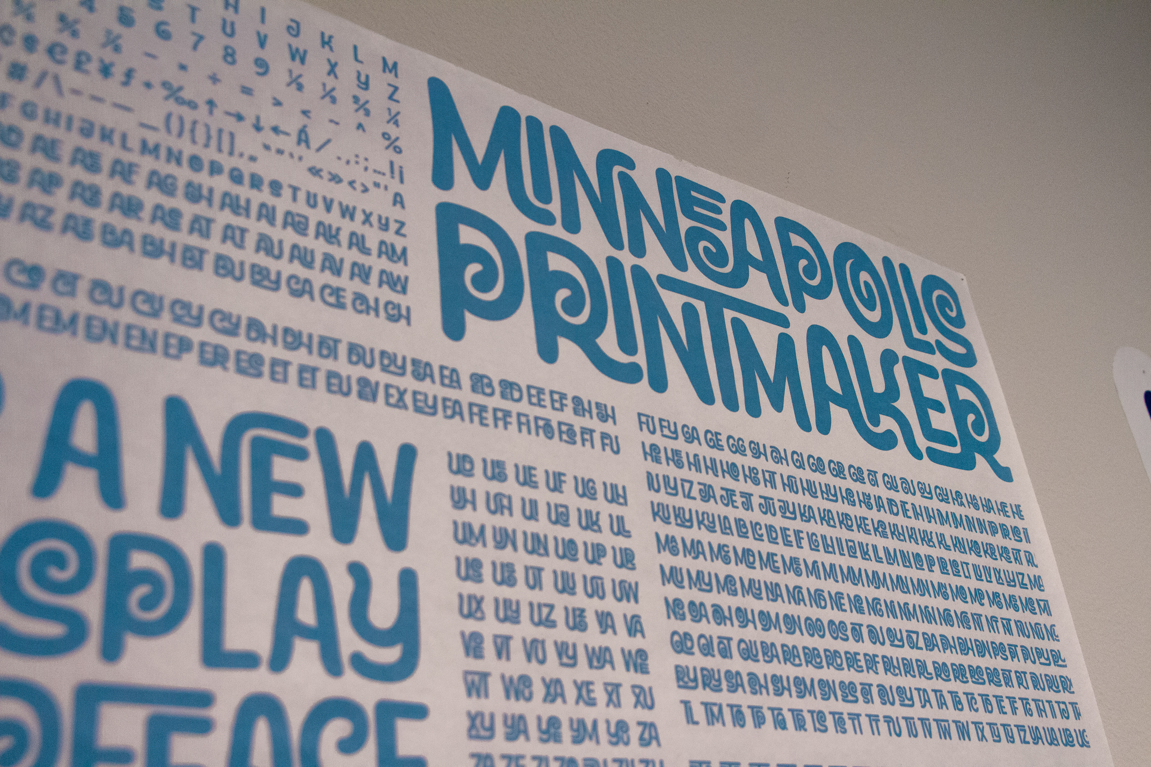
Typeface showcase poster (close-up)
Typeface showcase poster (close-up)
Typeface showcase poster (close-up)
Download the font display
Table setup
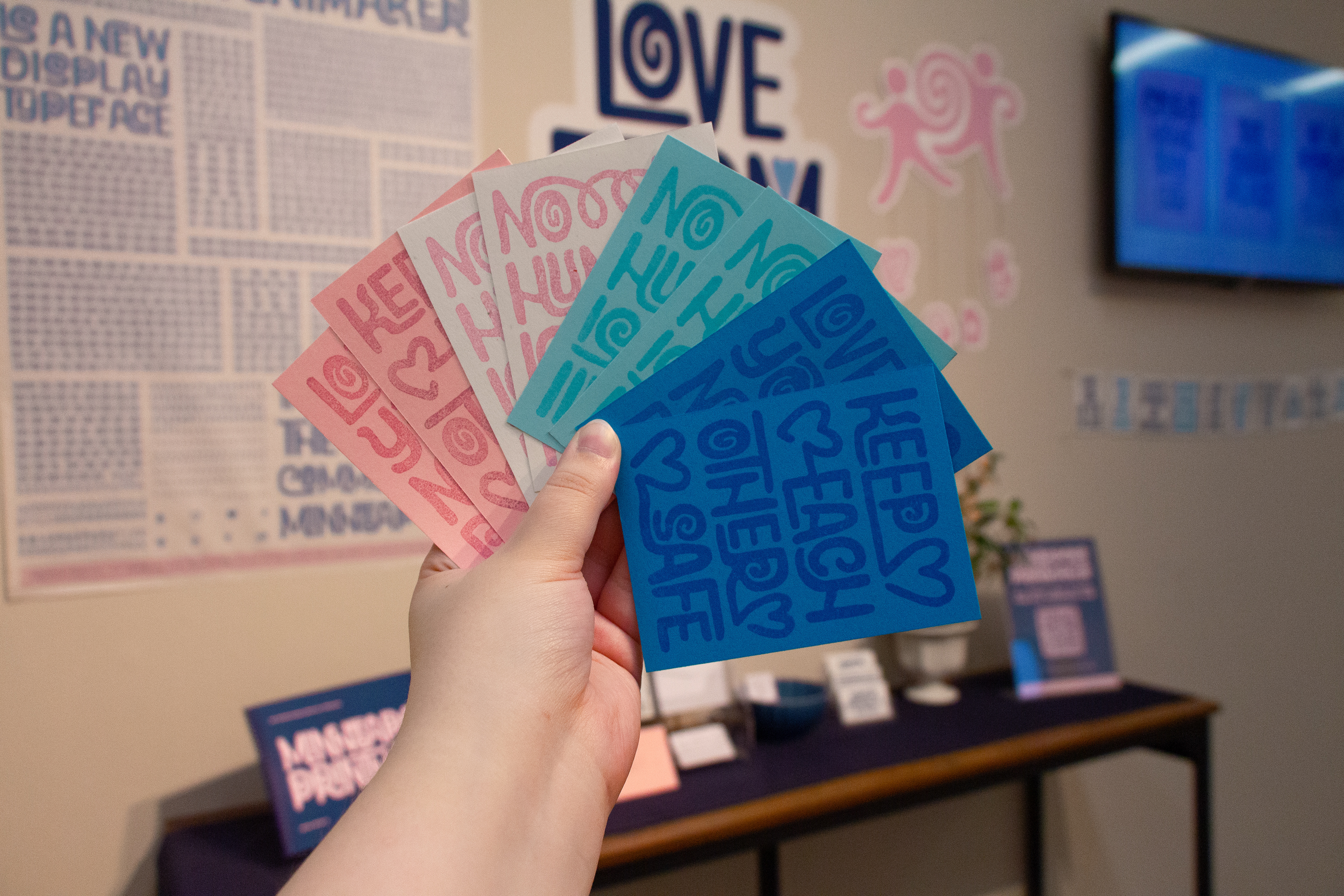
Mini prints + envelopes
Mini prints + envelopes (close-up)
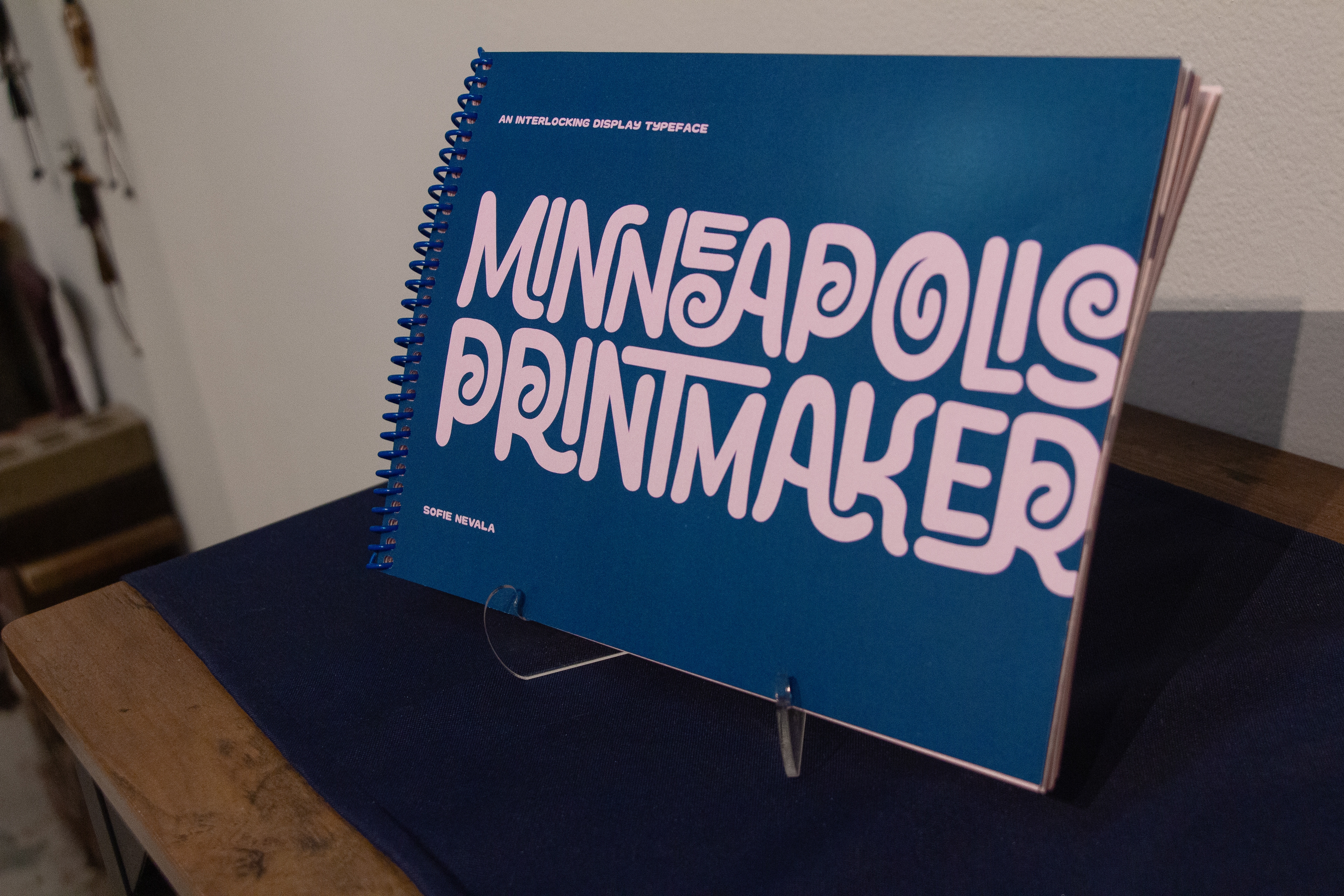
Typeface showcase book (front cover)
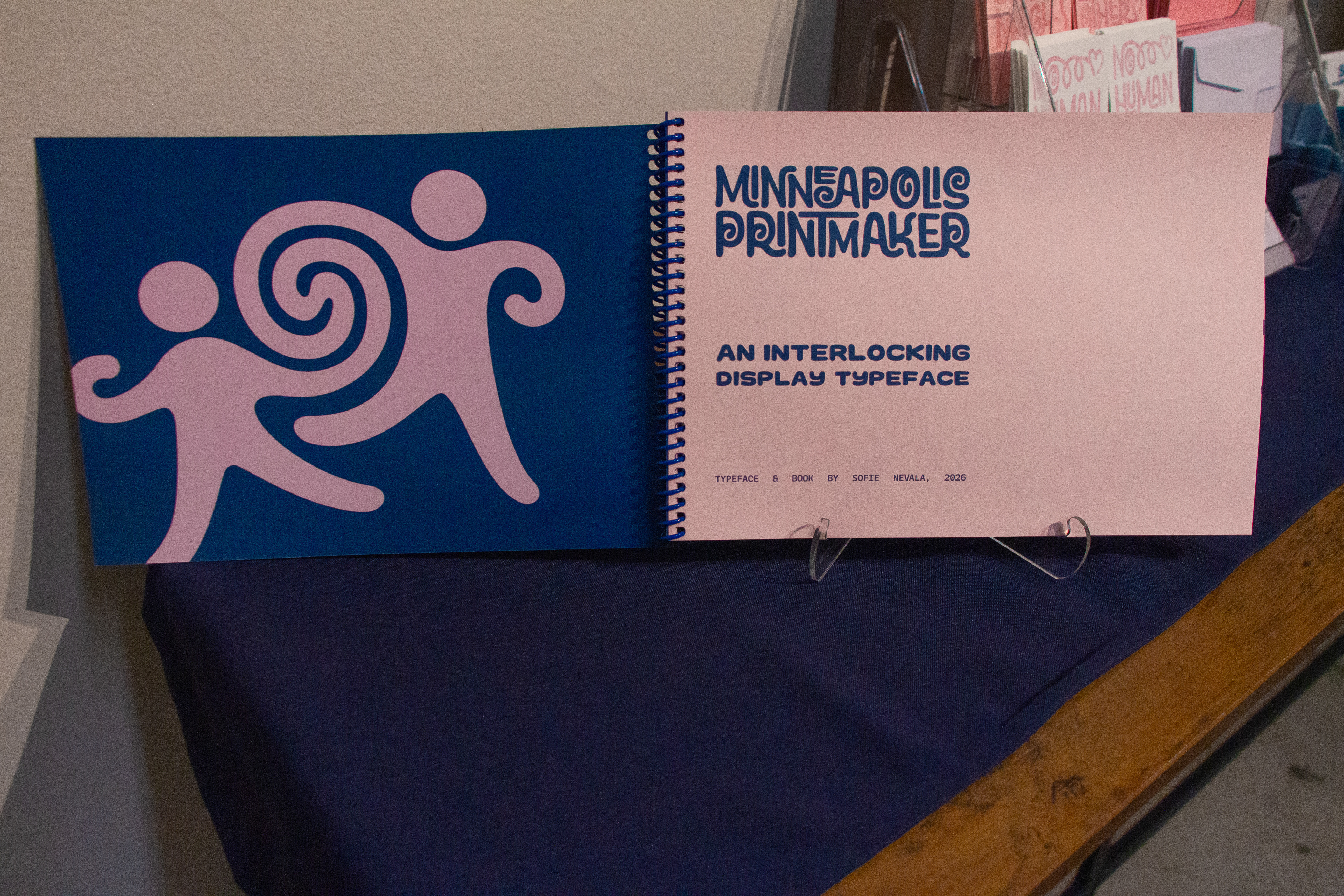
Typeface showcase book (inside cover)
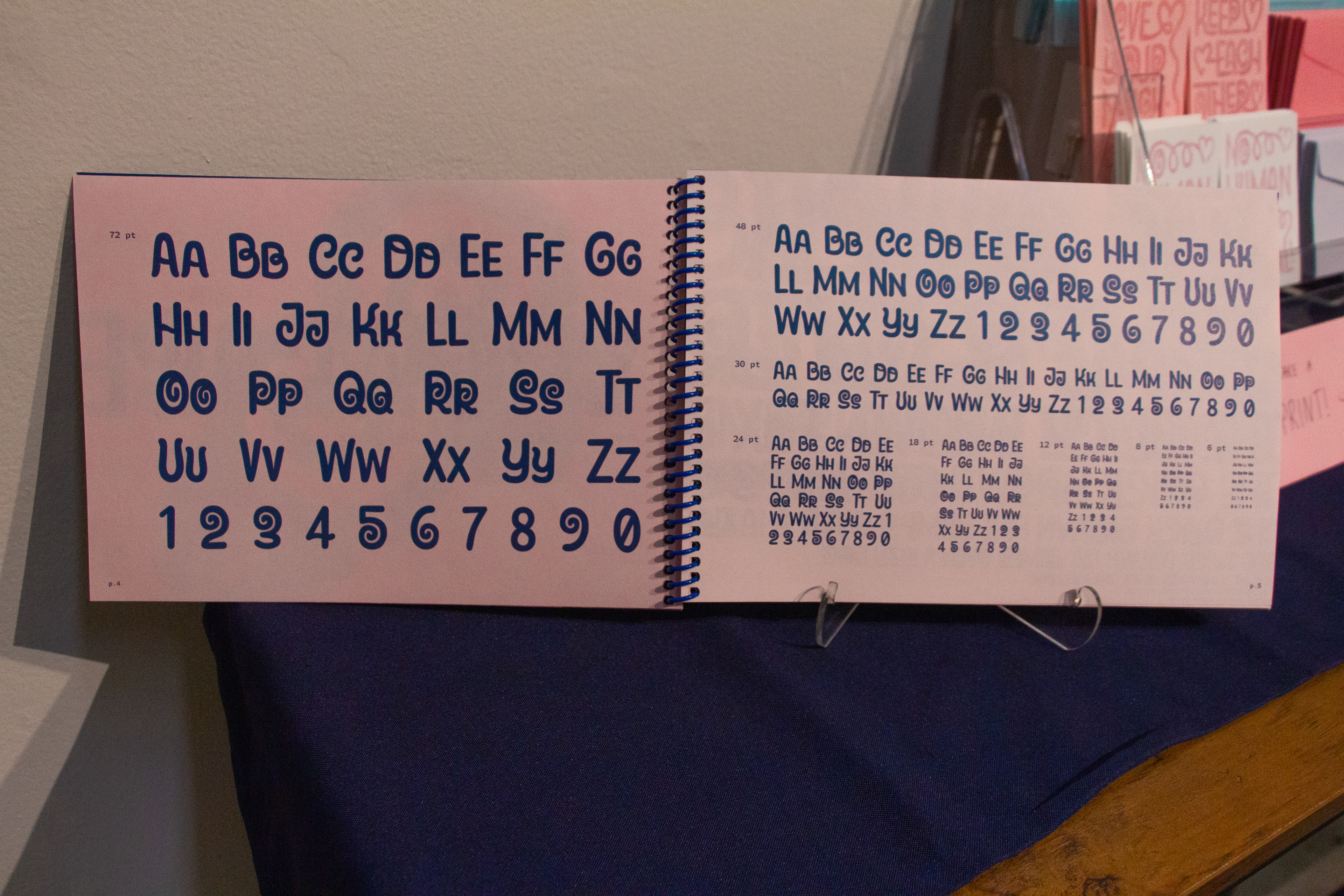
Typeface showcase book (inner pages)
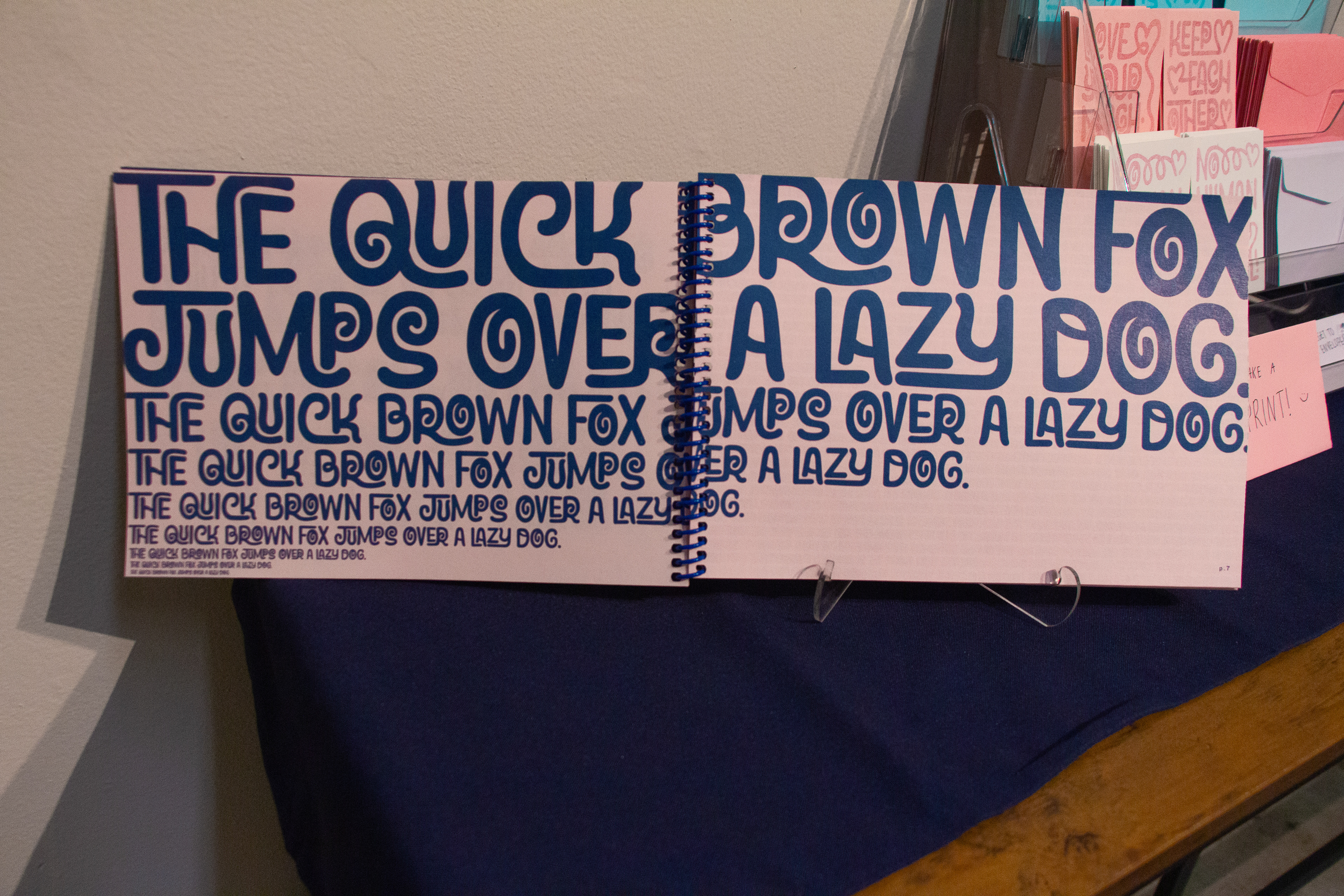
Typeface showcase book (inner pages)
Typeface showcase book (back cover)

Die-cut stickers
Business cards
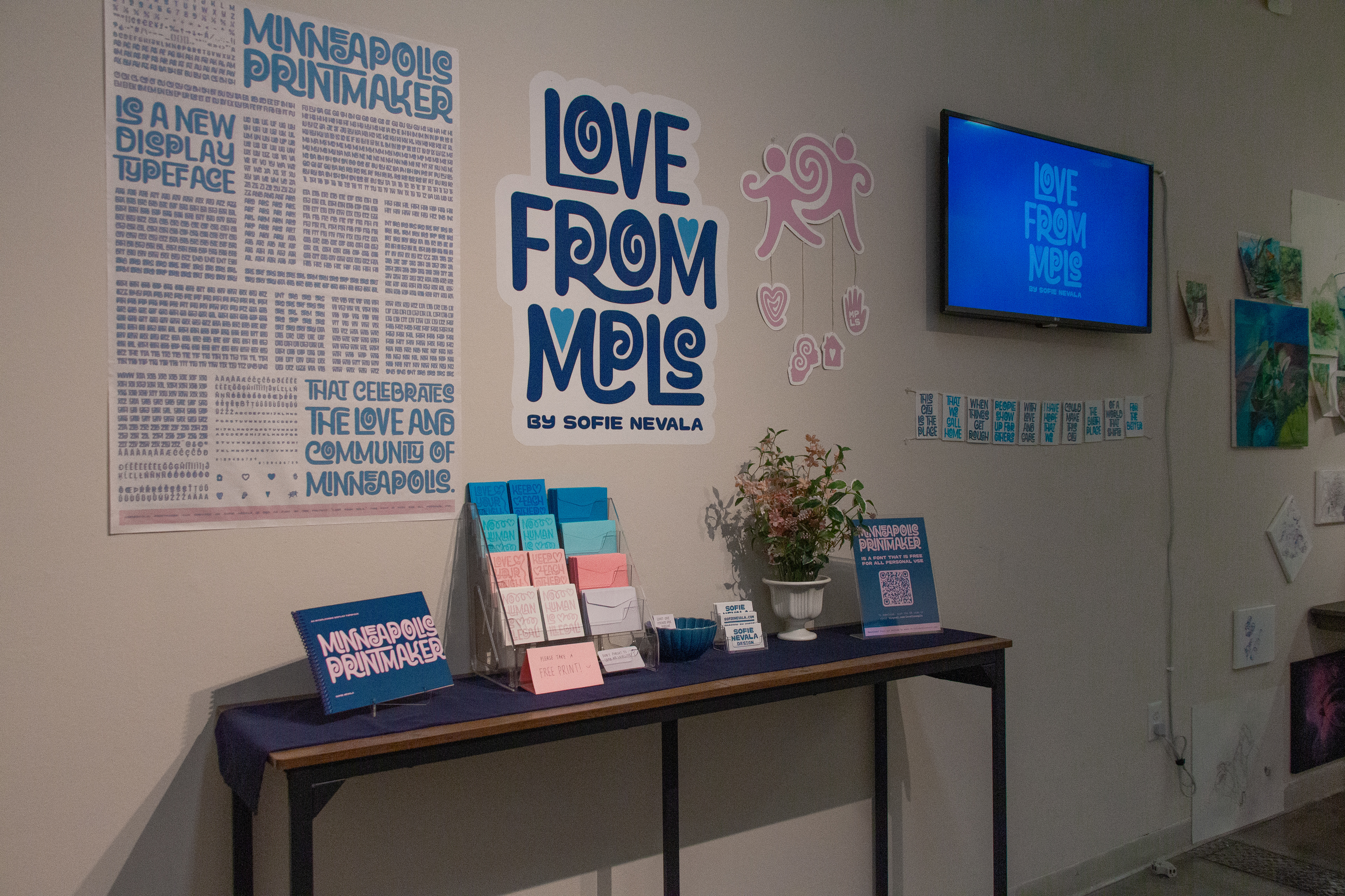
Full setup
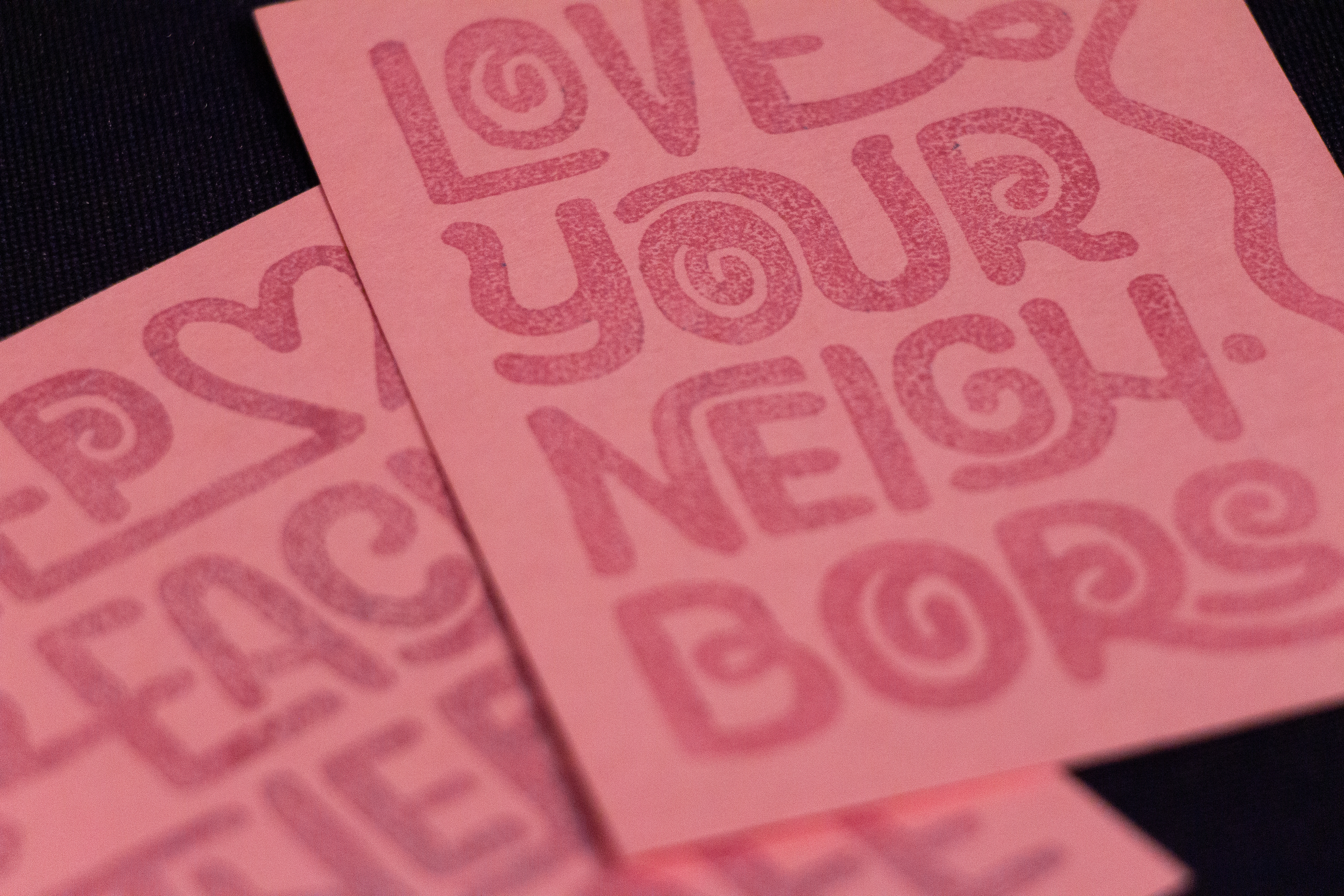
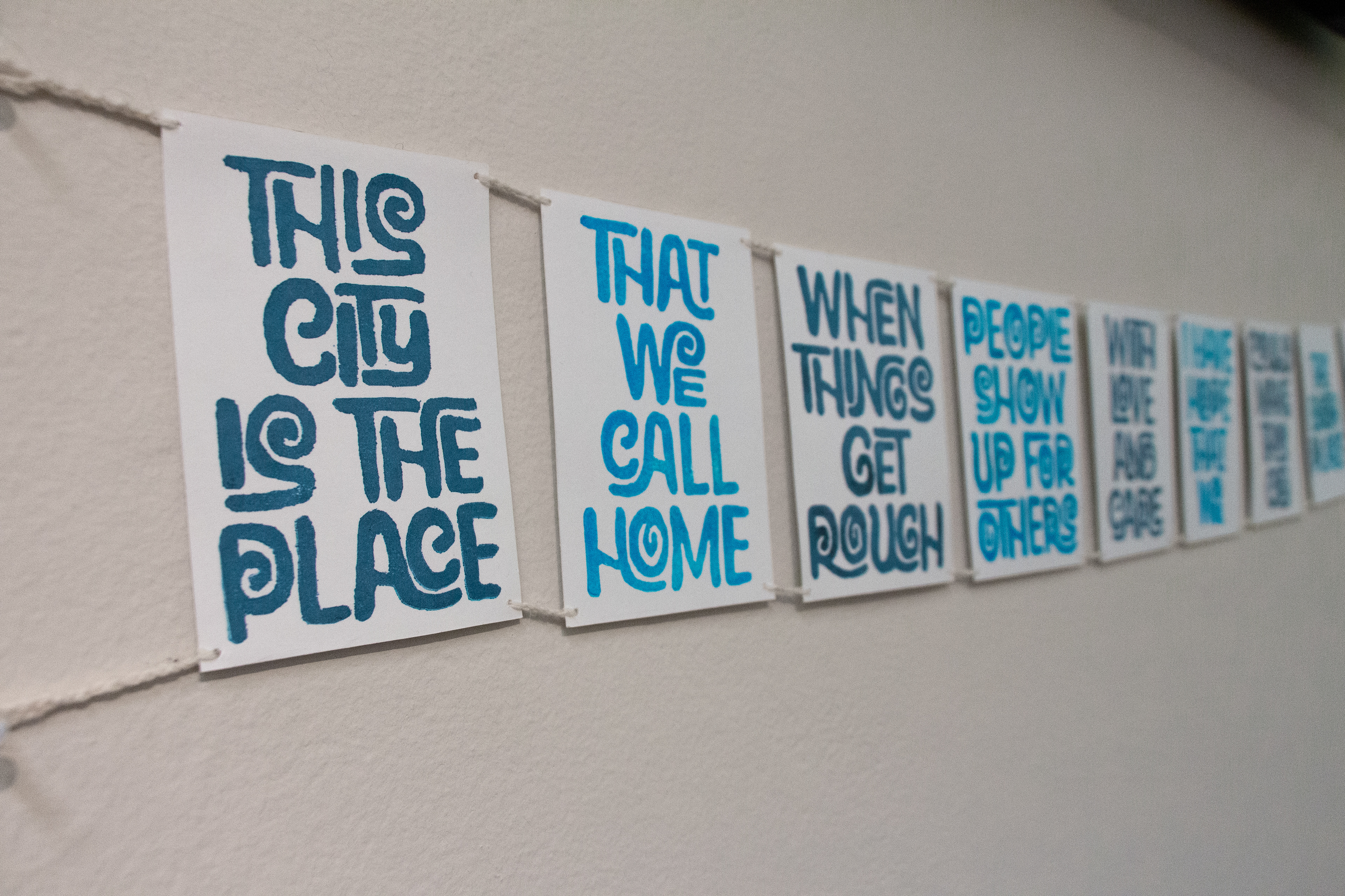
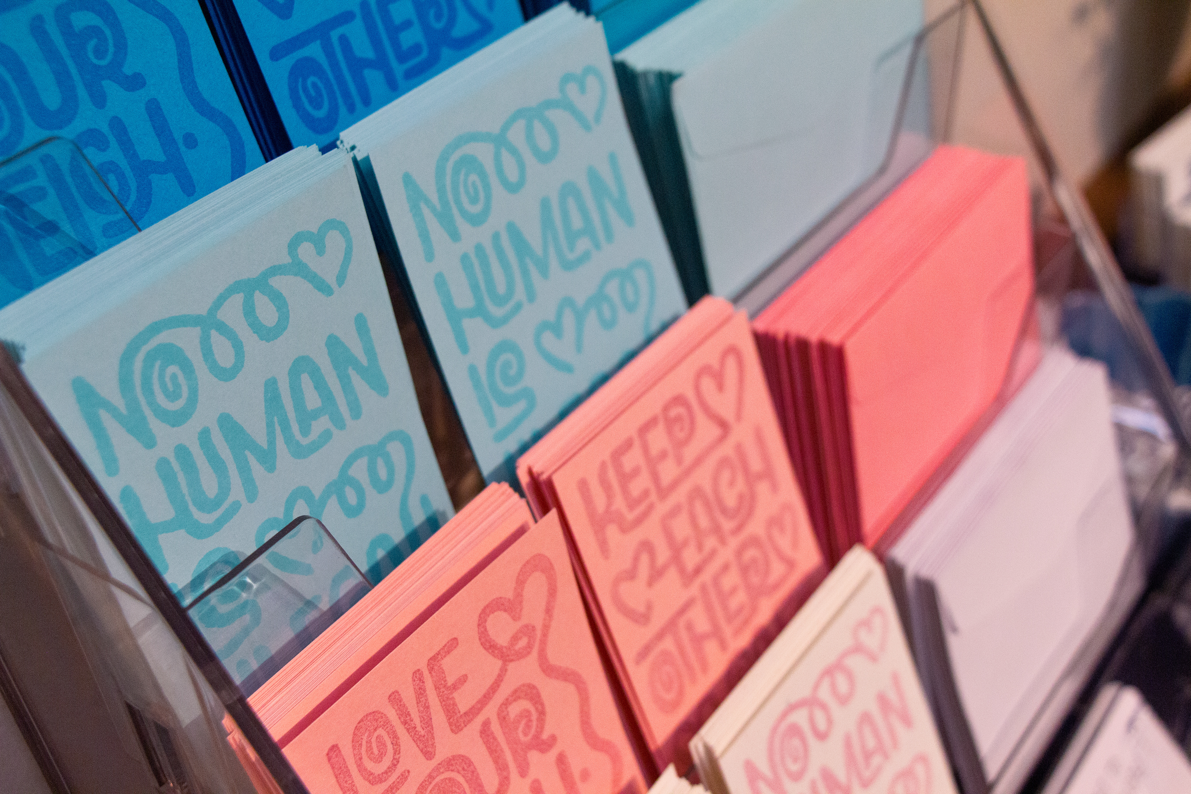
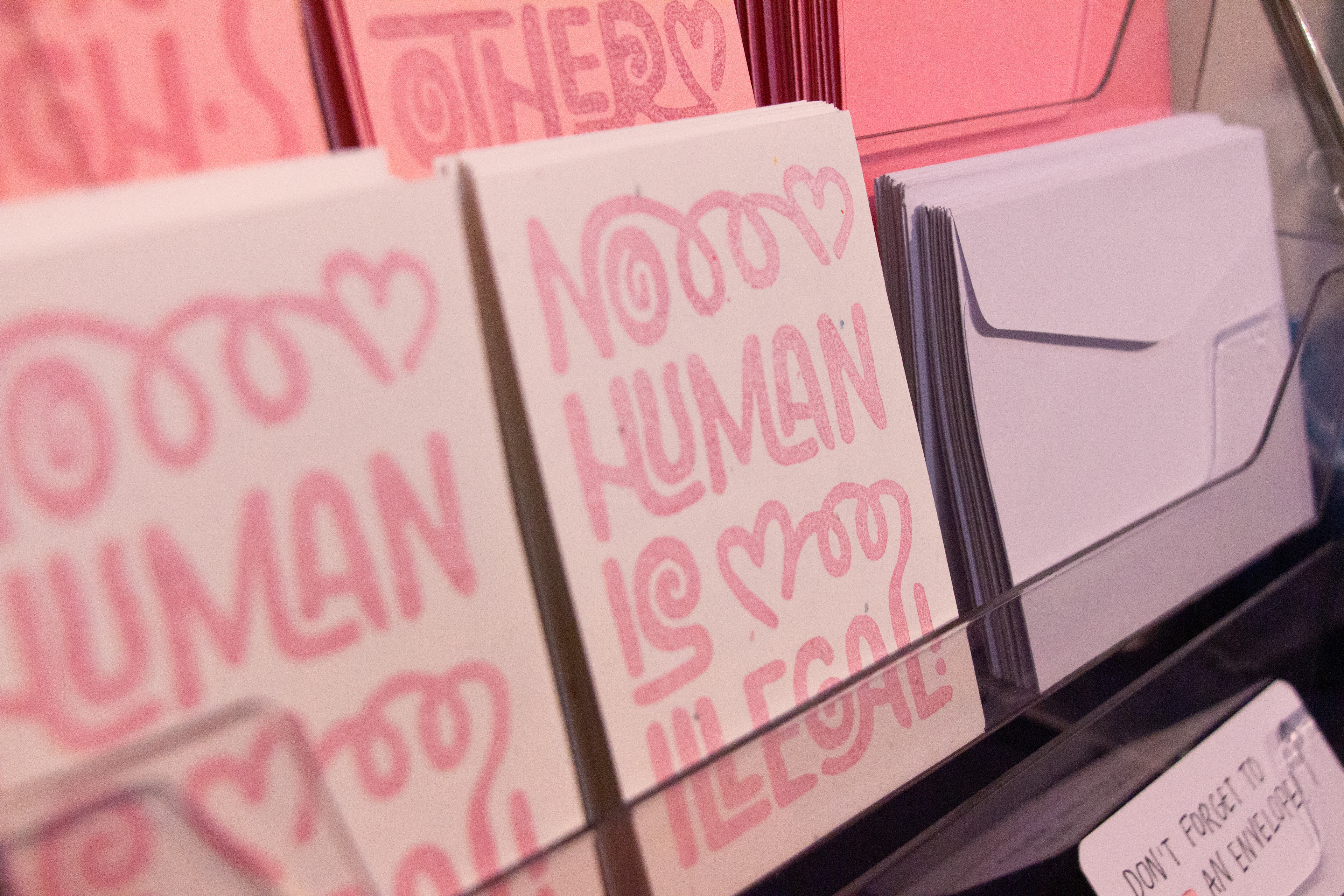
Mini hand-stamped prints (close-up)
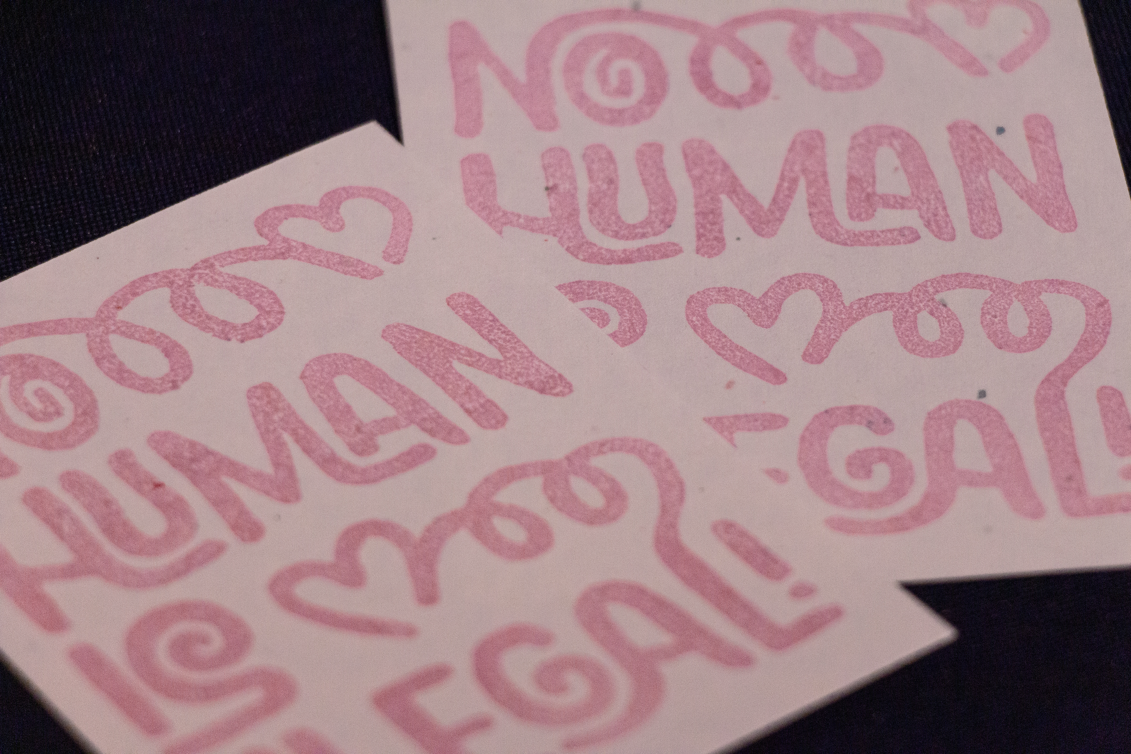
Mini hand-stamped prints (close-up)
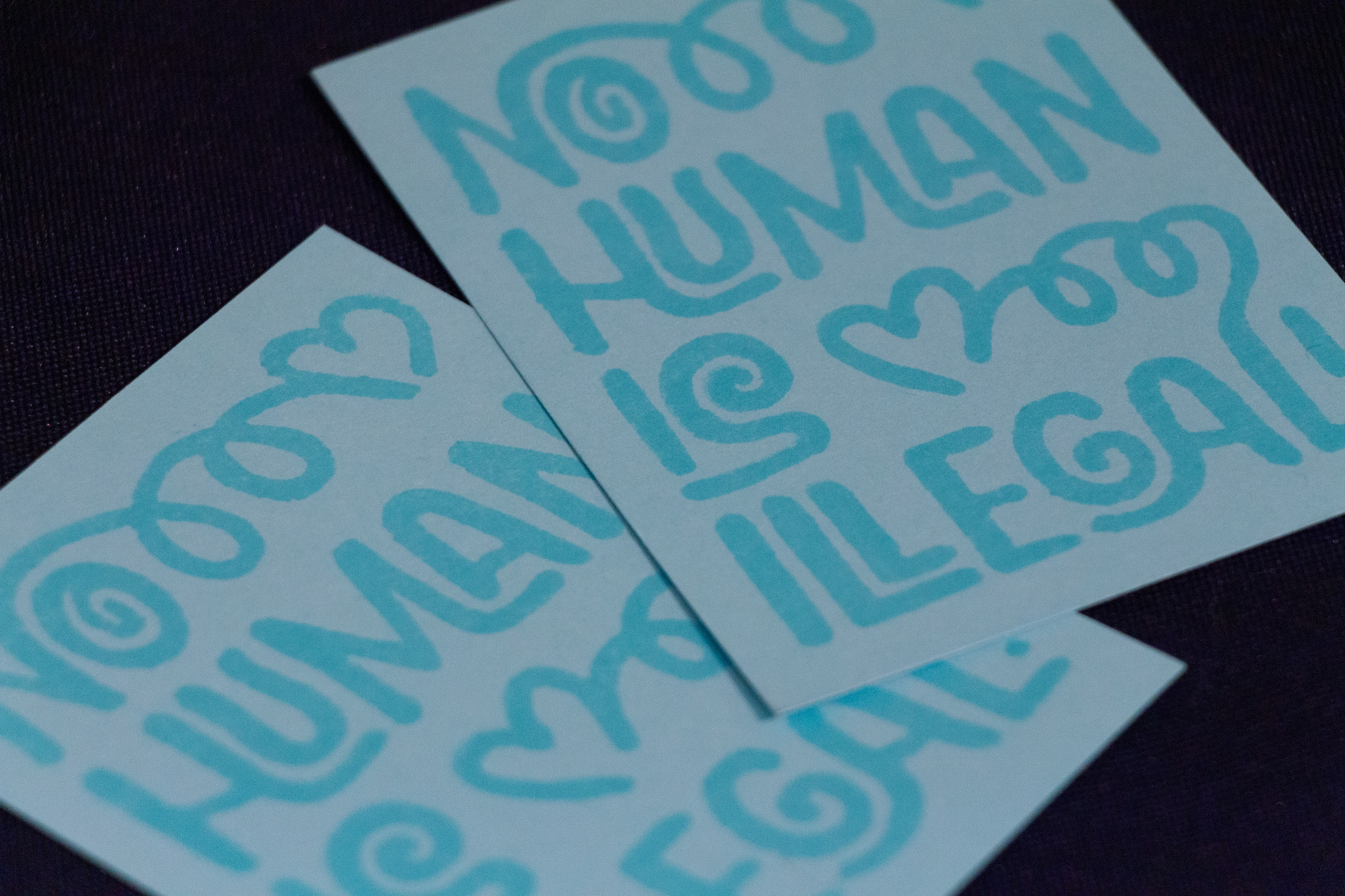
Mini hand-stamped prints (close-up)
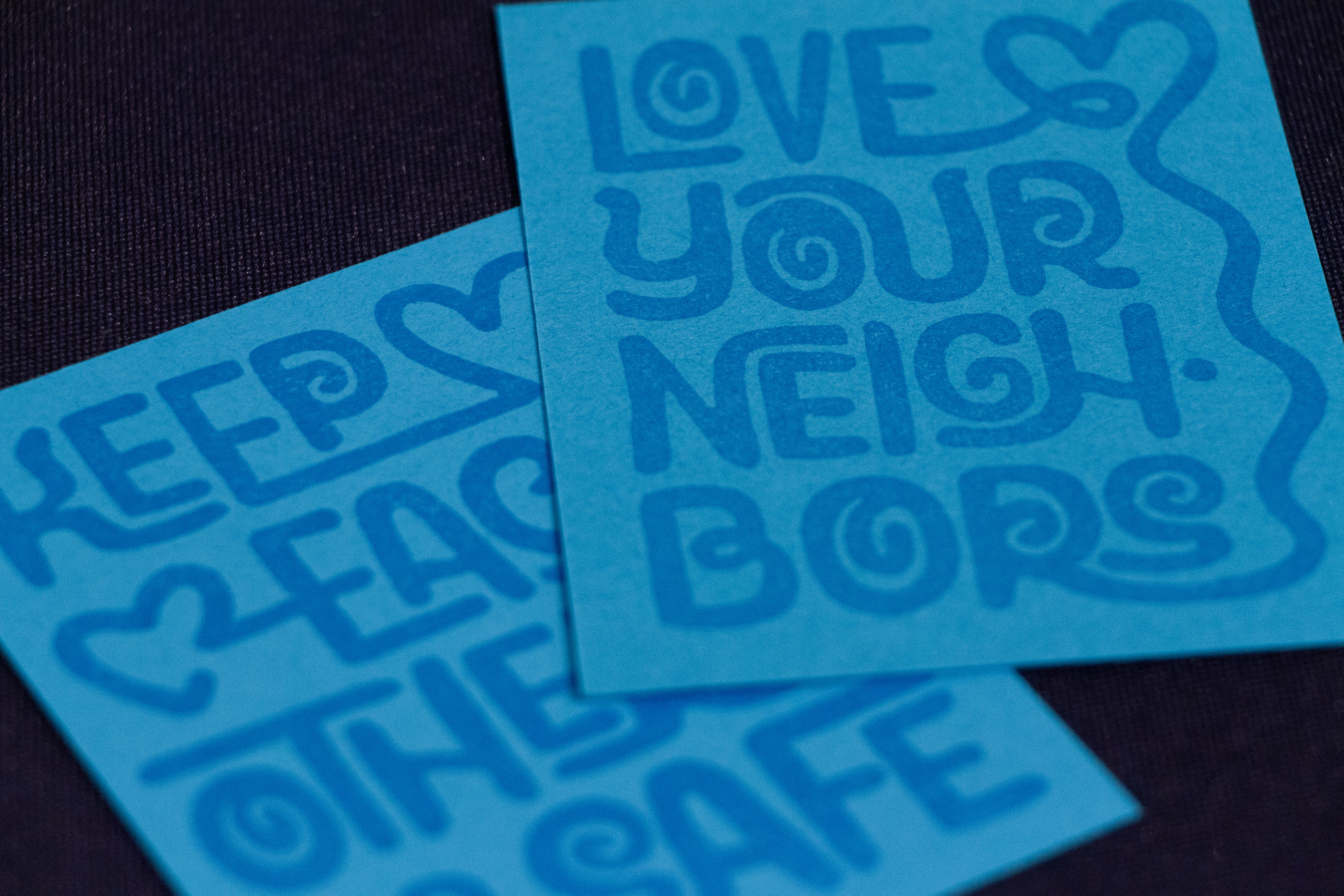
Mini hand-stamped prints (close-up)
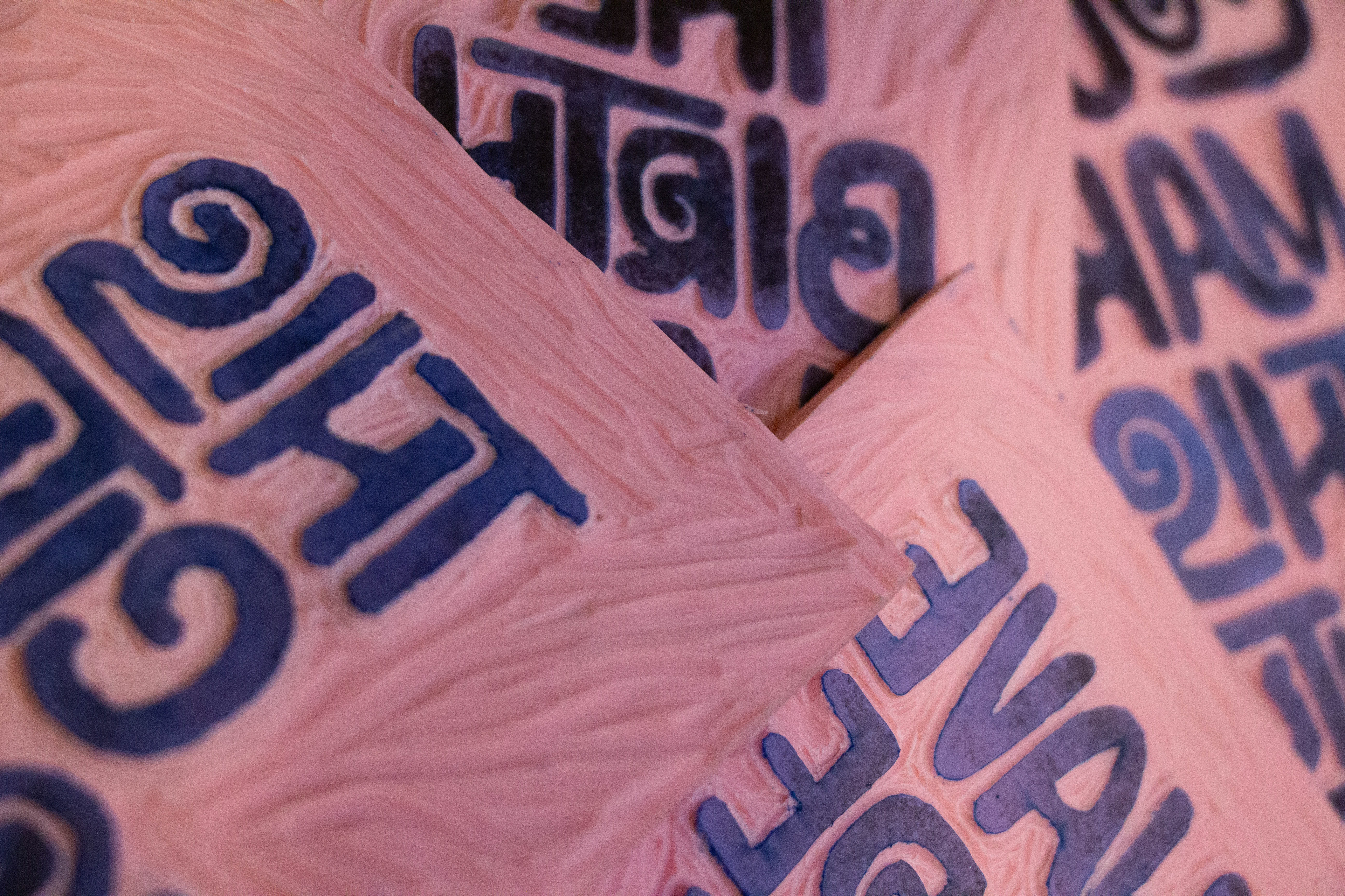
Rubber hand-carved blocks
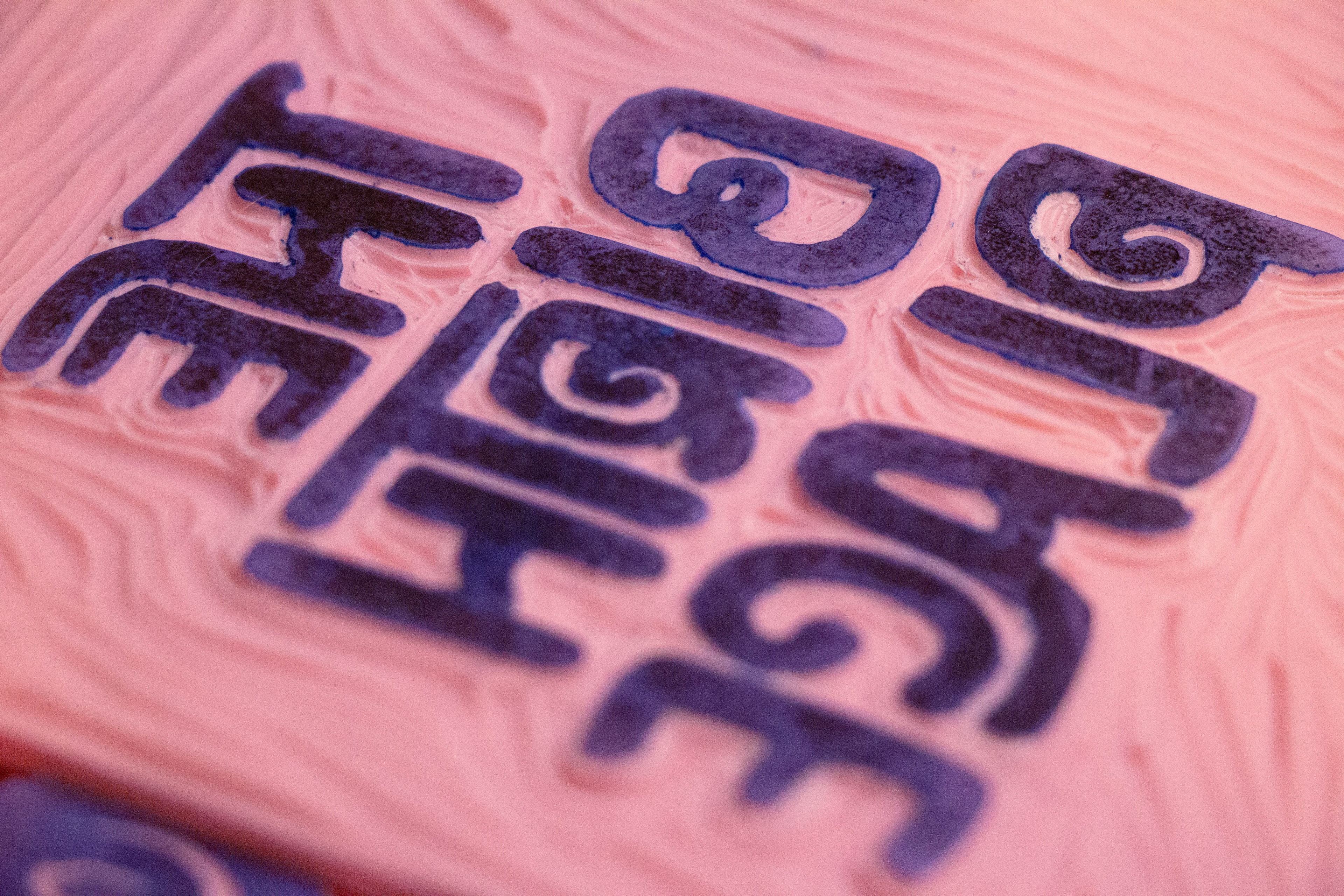
Rubber hand-carved block (close-up)

Rubber shavings from carving process